CLINICALLABS
A site for very defined and differentiated users
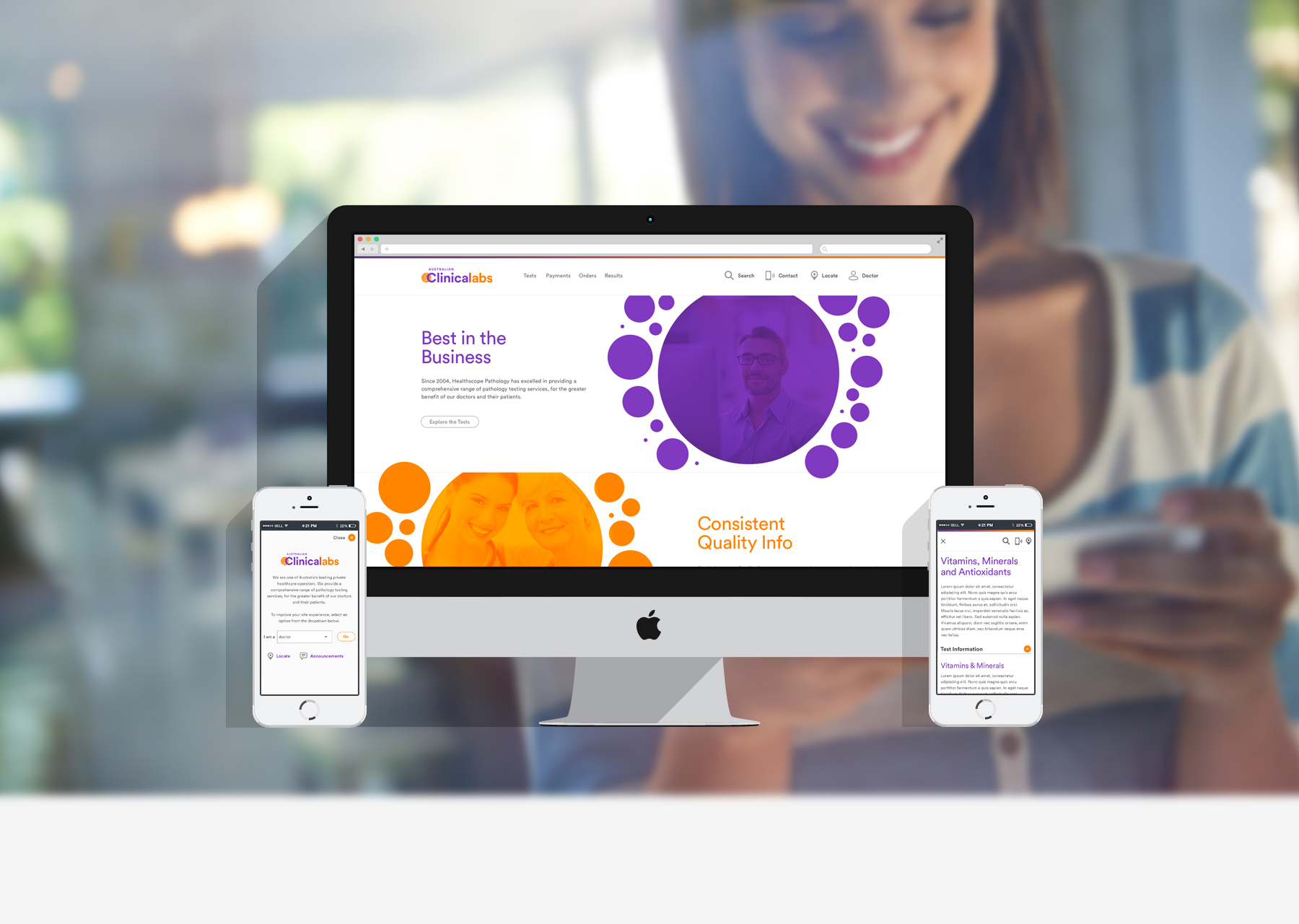
The project
The Brief
With an impending rebrand, ClinicalLabs, one of Australia’s biggest pathology providers, saw an opportunity to rebuild their site.
We were briefed to redesign their site, migrate the site to a new custom CMS, and improve the overall user experience.
Users and audience
There are four main users that visit the site for very different reasons. These include:
Doctors – to research medical tests, give patients instructions, find collection instructions, and order equipment.
- Patients – to find directions to collection centres and download patients guides.
- Commercial businesses – to find information on commercial testing services.
- Health practitioners - to research functional tests, give patients instructions, find collection instructions, and order equipment.
Constraints and challenges
The site had to address the informational needs for four very different customers. Each persona had completely different motivations for visiting the site.
There was a huge amount of important information that had to be provided, which could easily overwhelm the user. With nearly 130 pages in the top 3 layers of the site map alone, and hundreds of tests, the site map and its organisation had be considered carefully.
Furthermore, we were very short on time due to legal requirements, and had to proceed with a shortened UX process.
The Solution
With our site, a profile selector was placed in the top navigation, and when employed, filtered the content on the site. This simplified the site architecture, allowing users to quickly access pertinent information and pages.
A new search engine was also designed to maximise efficiency when looking for a test. The search would provide different links and resources, depending on which user profile was selected.
The site structure and hierarchy was changed to a test focus. The user could navigate to a test easily by the top navigation, and receive information that was directly relevant to them.
My role
As the UX architect, I was responsible for the customer experience and UAT. I designed the user experience, informed design decisions and completed UAT with developers.
THE UX PROCESS
01/ Proposal
Documentation was created for client approval, defining our UX approach, objectives, reasoning, timings and costs.
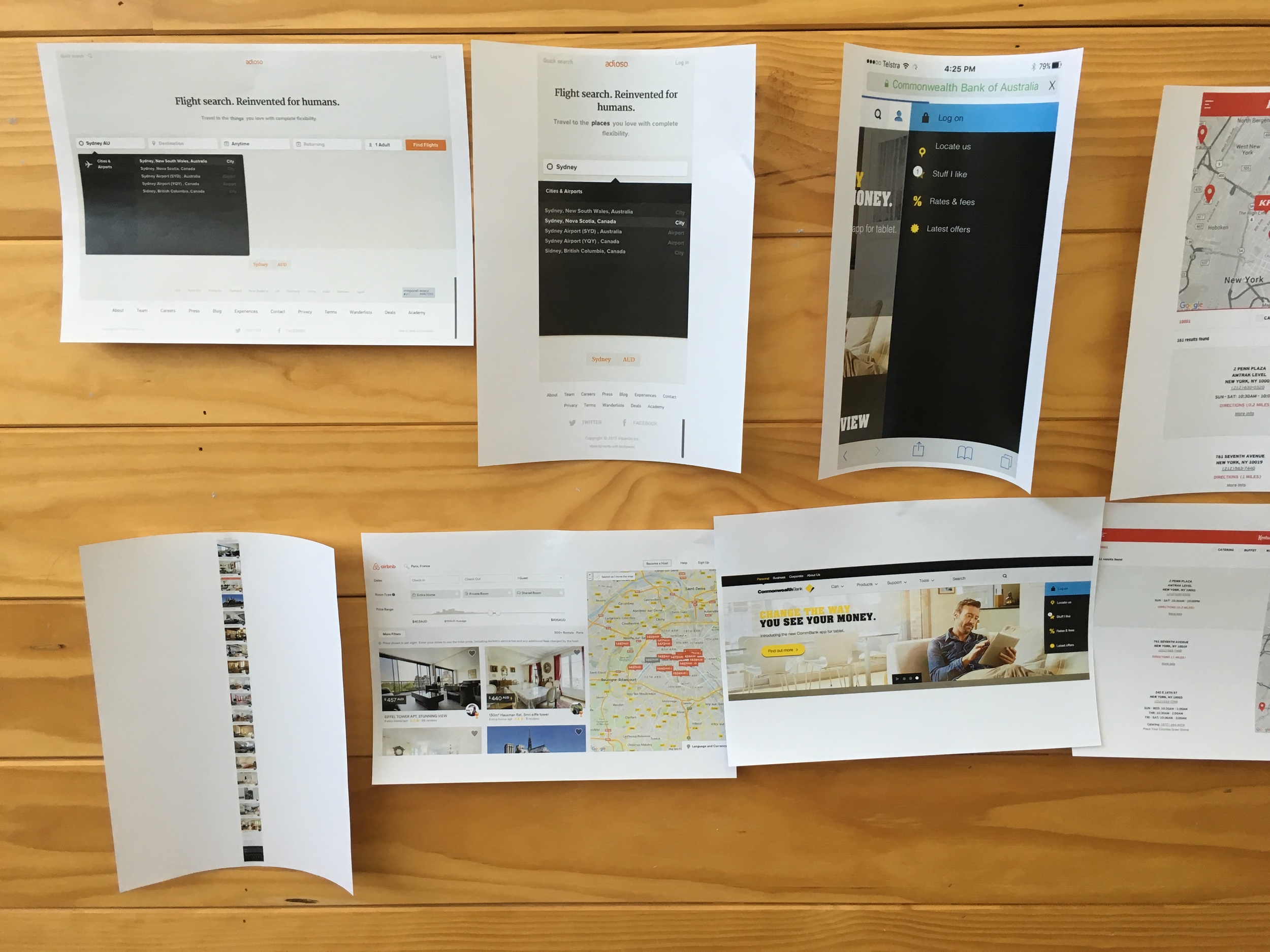
02/ Competitor and best practice review
Competitor sites were reviewed and evaluated. Insights and recommendations were provided, based off best practice examples for our main user goals.


03/ Card sorting and site map
Once we confirmed the necessary content required on our site and reviewed site statistics, we ran a workshop, using Treejack. We established the IA organisation and ensured an intuitive taxonomy, which was detailed in a site map.


04/ Sketches
Low fidelity UX sketches were created, with feedback from the design team. Sketches included layouts of content, page features, possible transitions and design patterns.


05/ Interactive wireframes
Created in UXPin, responsive interactive wireframes allowed us to obtain feedback on site layouts. By testing contents and options, we were able to confirm the effectiveness of interface elements and navigational systems.
06/ Annotated wireframes
By annotating the wireframes, and working with developers, we provided a document that allowed timings and costs to be confirmed for the production phase. It also clearly defined all interactions and behaviours for future reference.


- LESSONS -
THE USER IS KING
When dealing with large amounts of information, allowing users to execute goals as easily as possible has to be on the forefront of the experience. The site structure should always be ordered and prioritised from the view of the user.